


Android 17 is almost here.
Love it or not, Google’s next major mobile OS update is right around the corner. If you own a Pixel 6 or later, you can already try one of four public betas available right now — and the stable release could land as early as June.
By all accounts, this will be an incremental update, which is perfectly fine. And there’s already plenty to get excited about: separate Wi-Fi and mobile data toggles in the quick settings panel, the long-awaited option to hide app labels on Pixel, and a dedicated volume slider for Gemini, Google’s virtual assistant.
But not everything is worth celebrating. One critical area has been almost completely ignored — and Google doesn’t seem to care. For me, it’s a dealbreaker, and it’s the main reason I’m still not ready to switch back to a Pixel as my daily driver.
Widget woes
A great widget is one of the small joys of smartphone life. When done right, these compact app extensions surface exactly the information you need — no tapping, no swiping, just a quick glance.
But functionality alone isn’t enough. A widget also has to look good. Think about it: you check your home screen dozens of times a day. An ugly widget isn’t just a minor annoyance — it’s a recurring eyesore you’ll eventually get tired of staring at.
First-party widgets on Pixel phones are hidden behind dated, cluttered and confusing designs that make poor use of the available space
Google, however, hasn’t gotten the message. Its first-party widgets on Pixel phones aren’t short on information — but that data is buried behind designs that feel dated, cluttered, and poorly thought out, wasting much of the space they occupy.
This becomes especially hard to ignore on the Pixel 10 Pro XL, where I’ve been testing the Android 17 beta. Despite its expansive 6.8-inch display, the home screen quickly starts to feel overwhelmed — packed with widgets that look oddly out of place against an otherwise polished and refined software experience.
![]()
When Google finally allowed users to remove the notoriously cluttered ‘At a Glance’ widget last year, I went looking for a worthy first-party replacement. What I found was deeply underwhelming.
Weather felt like the natural starting point — but the stock Pixel Weather app offers only two widget options: a bare-bones temperature readout, or an oversized panel crammed with forecasts and a ‘feels like’ temperature. Neither hits the mark. It’s a frustrating all-or-nothing choice with no sensible middle ground.
![]()
Maybe a clock widget would save the day. Google does offer more variety here — but “basic” would be putting it kindly. The best of the bunch is a simple digital display showing the date and time. That’s about as exciting as it gets.
What about a calendar widget to keep tabs on upcoming events? This is where things get truly frustrating. Google Calendar is arguably the worst offender of all, offering just two choices: a cramped schedule view that never shows enough to be useful, or an overwhelming month view that’s more visual noise than helpful information. For an app this central to daily life, the wasted potential is staggering.
And then there’s Digital Wellbeing — perhaps the most baffling widget of them all.
Seeing my screen time the moment I unlock my phone has genuinely helped me cut down on mindless scrolling. It’s a powerful nudge. But on Pixel, I dread looking at it — and not because of what the numbers say.
The widget pairs a bare, uninspired heading with text that looks like it was thrown together in minutes. Google does at least include three bubbles of varying sizes to represent your top apps for the day — a nice idea in theory. In practice, however, it’s nearly impossible to tell them apart. In dark mode, the three colors are light grey, medium grey, and dark grey. Prefer light mode? Prepare yourself for the dazzling palette of black, grey, and off-white.
![]()
It completely undermines the whole point of a chart like this: making data easy to read at a glance. Without distinct, contrasting colors, the bubbles blur into one another — and what should be an instant snapshot of your habits becomes just another thing to squint at.
I also like to pin the occasional Google Keep note to my home screen as a quick reminder. It should be simple and seamless — but the experience is anything but. The widget is, frankly, an eyesore. See for yourself:
This disappointing pattern is repeated across basically every Google widget I’ve tried plonking on the home screen. They’re either too big, too ugly or too cluttered, with the worst offenders effortlessly achieving all three.
The lack of attention on widgets in Android 17 is a major oversight
Sure, plenty of third-party apps offer far more polished widgets. But for those of us who rely on Google’s own ecosystem, switching to an alternative service just to get a decent-looking home screen isn’t a solution — it’s a workaround for a problem that shouldn’t exist in the first place.
Subpar first-party widgets have plagued Pixel phones for years. And while Android 17 brings some genuinely welcome improvements elsewhere, the complete lack of attention to widgets makes it one of the update’s most glaring blind spots — and a missed opportunity Google can’t afford to keep ignoring.
One UI shows what’s possible
If every Android manufacturer struggled with widgets, perhaps Google could be forgiven. But Samsung’s One UI proves that thoughtful design is entirely achievable — and the contrast is hard to ignore.
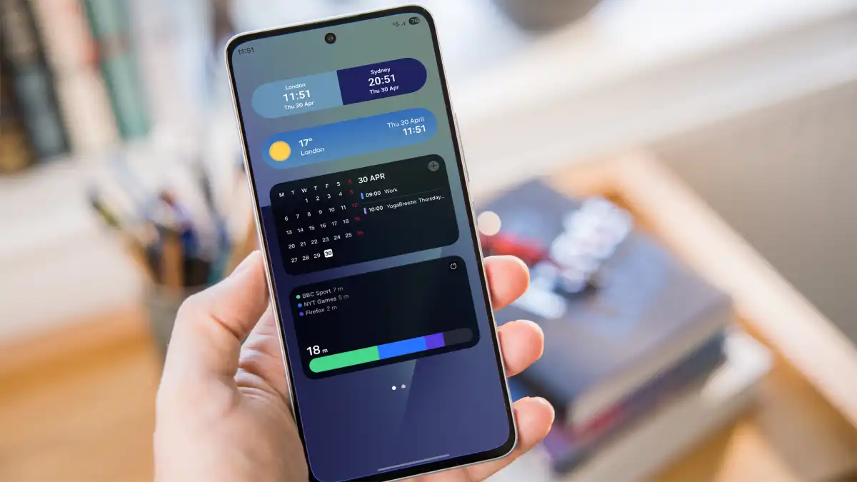
As a quick experiment, I challenged myself to find Samsung equivalents for every Pixel widget I’d criticized above, using my Galaxy Z Fold 7. It took just a few minutes — and the result was a home screen that looked and felt worlds ahead of what Google offers.
The dual clock widget alone is a masterclass in subtle detail, automatically adjusting its background based on the time of day for a seamless two-tone effect. Samsung’s weather widget is equally impressive: clean, minimal, and visually responsive to current conditions.
Within minutes, my Samsung home screen was kitted out with a selection that looked and performed 10 times better than Google’s
Samsung’s Calendar widget strikes the balance Google never managed — a compact month view paired with the day’s key events, neatly presented in a single glance. Exactly what a calendar widget should be.
But the real standout is Samsung’s Digital Wellbeing equivalent. The concept is identical to Google’s — but the execution couldn’t be more different. Gone are the murky, indistinguishable bubbles, replaced by a sleek, clean bar where each app is color-coded in vivid, immediately recognizable hues: green, blue, and purple. Clear. Intuitive. Effortless to read. What a radical idea.
Once upon a time, Samsung’s Android skin was mocked for its ugly design. These days, that couldn’t be further from the truth, and it’s particularly evident in the excellent selection of first-party widgets.
But, in truth, almost every Android phone maker does a better job of widgets than Google. Pixel owners deserve better.
A key difference-maker
A few widgets slapped on the home screen might not sound like a huge deal, but they’re a massive turn-off for me. I use widgets every day, and if they’re not up to scratch, sticking with that phone will feel like a huge chore.
Google would do well not to underestimate how much widgets shape the overall look and feel of a phone. Pixel software has earned a well-deserved reputation for being slick and intuitive — which makes this persistent blind spot all the more puzzling.
Unless Google pulls off a last-minute surprise in the final Android 17 release, another year of uninspired, neglected widgets looks increasingly likely. And until that changes, Samsung stays on top — and on my home screen.