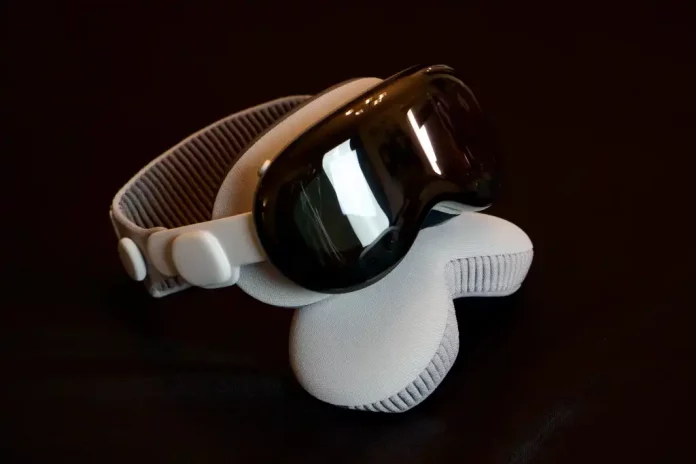
Apple Vision Pro spatial computer, a VR headgear featuring pass-through video, hand tracking, and eye tracking, is not your average VR headset. It’s not merely a more costly Meta Quest 3 with better screens.
It includes certain elements, but it is not limited to them. There are times when you have a strong gut feeling that what you’re doing will be the way things are in the future. After a week of using Apple Vision Pro every day, one thing keeps running through my mind. “This is going to be great…one day.”
But that’s the catch. The magnificence of this product seems to be constantly in the distance. Using the Vision Pro for anything other than media consumption is now an exercise in compromise and inefficiency, and even as a pure consumption device, there are significant limitations and tradeoffs.
If only it were lighter. If only it was cheaper. If only I could connect USB-C gadgets to it. If only there were more applications. If only the applications worked better.
if only.
When the “wow” moments pass (and there are a lot of them), you’re left wondering when Vision Pro will do this or why it won’t do that, and you finally decide to just use your Mac, iPad, or iPhone to accomplish what you want.
Some of Vision Pro’s shortcomings can be solved with software upgrades, while others are hardware-related, but it’s difficult to suggest this costly face computer right now to anybody other than die-hard Apple early adopters.
Incredible but limiting hardware
You’ve undoubtedly seen videos and pictures online that demonstrate the point-of-view experience of Apple Vision Pro. It may appear to you to be using a Meta Quest 3 or a comparable competitive consumer headset.
These videos do not capture the experience. Apple’s micro-OLED displays boast high quality, color depth, and dynamic range. You do not see pixels. There is no “screen door effect.” In the correct lighting, there is some lens glare, although it is less noticeable than on most other headsets.
Comparing rendered material on a Meta Quest 3 to an Apple Vision Pro is analogous to utilizing an old 1080p TV to a new 4K HDR OLED. To make this work, Apple employs a number of gimmicks behind the scenes, such as foveated rendering (in which just the precise region of the screen you’re viewing is drawn in full resolution and everything else is slightly blurry, similar to your true eyesight).
It’s kind of like magic
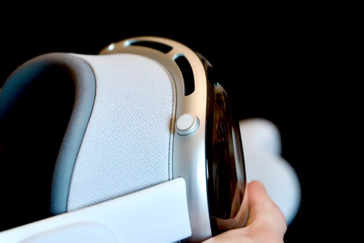
“Look and pinch” is the primary way to interact with visionOS, which is both technically remarkable and limited. After years of using multitouch interfaces, having only one touch point (per hand) feels restrictive. Locking your focus on anything also requires some adjusting. Our natural impulse is to glance at something and then look away, however this does not work in this situation. To control the interface element, you must continue to stare at it. Consider turning off a light switch: You just need to gaze at it long enough to precisely move your hand toward it, but Vision Pro wants you to stare at it until the operation is complete.
The same applies to pass-through video. The view of the outer world is both excellent and insufficient. Apple maintains the total photon-in-to-photons-out delay to 12 milliseconds or less, but when you leave a brilliantly lighted location, the video stream rapidly gets grainy and the colors mute. I don’t consider my house extremely gloomy, but my regular lighting wasn’t bright enough to get great fidelity unless I turned on a lot more lights than I’m used to.
The straps function well—the twin loop band distributes the headset weight more evenly, the light seals are comfortable and effectively block out light, but the magnetic attachments are insufficient to keep them in place. It might be difficult to physically handle the Vision Pro without accidently bursting the light seal. To remove it, most people grasp the light seal, however Apple recommends grabbing the front display. Otherwise, you risk removing the light seal from the display and dropping it.
The device’s entire front is extremely glossy, making it impossible to see what’s going on and weakening its signature feature, EyeSight. It’s obviously a wonderful idea, but it just does not perform as Apple says, and it only serves to increase expense and complexity for no reason.
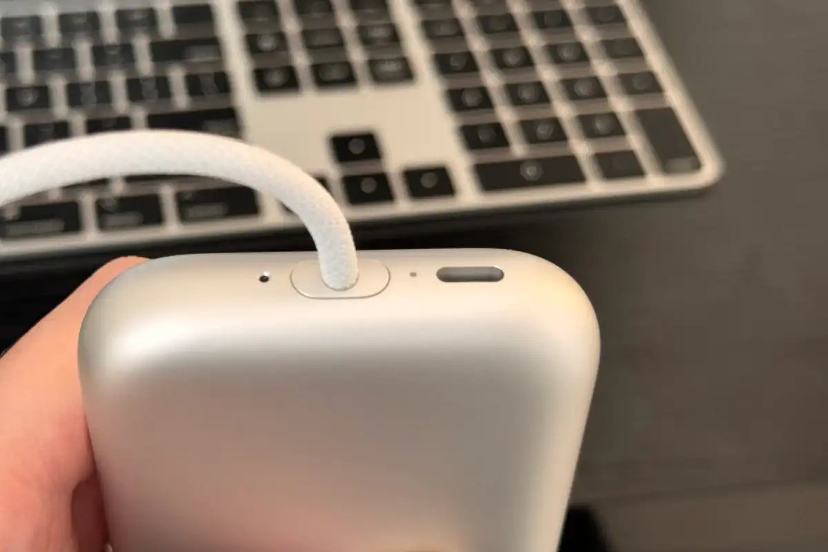
Finally, there is no data input at all—no USB-C, no Lightning, nothing—but Apple offers a $300 Developer Strap, which replaces the audio strap with a dongle that “provides a USB-C connection between Apple Vision Pro and Mac.” The battery pack’s USB-C connector is exclusively for power and will not recognize any other peripherals put into it.
Early, often clunky software
The software condition is best characterized as “fledgling.” It’s a bit annoying that some of the applications and interfaces are so limiting for the world’s largest and most valuable digital firm, despite having decades of software to draw on. Except for immersive video and some games, everything feels like a floating iPad window, even non-iPad apps.
You may easily resize windows, but they do not have the same appearance and feel as the “big boy” counterparts found on Macs. Third-party apps are largely for iPad, with less than a thousand visionOS-specific apps. Those who are present feel hurried. They’re typically buggy, generally consisting of a floating window that seems like an iPad app, and include gimmicky “spatial” capabilities.
For example, Carrot Weather is fantastic, but it’s little more than an iPad app with a pop-out “full globe” view that makes you think “oh neat!” but isn’t truly useful. I want to gaze at the actual world and see isobars and radar precipitation in the sky.
most of what the Vision Pro experience amounts to is floating windows anchored in the spaces around you
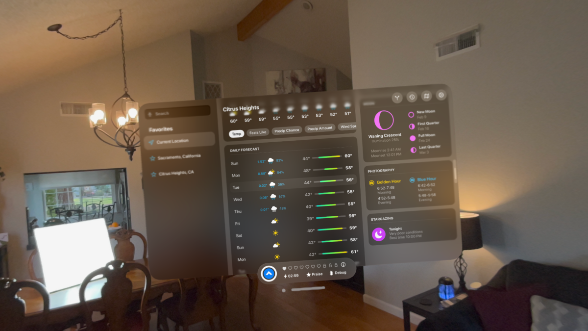
In fact, the majority of the Vision Pro experience consists of floating windows that are attached to the areas around you. I do not want to minimize this technological achievement. The windows are extraordinarily bright and colorful, and they appear to be a part of your actual surroundings. They obscure the actual world as needed, create shadows on flat surfaces, and never move even a millimeter.
But they are constantly tied to the space rather than to you. If you want a window to follow you around, you must physically grab its small window bar at the bottom and carry it. More many time, I’ve been unable to locate a running software since it’s in another room. The first time you stroll around your house looking for where you left the Safari window hanging, it’s really wonderful. Every time after that, it becomes aggravating.
Why can’t I double-pinch the window bar to attach the window to me rather than its current location in my living room? Something that easy feels like a must-have visionOS 2.0 feature.
If you want to run numerous programs at the same time (which you obviously do), you’ll rapidly run out of physical space. Layering windows on top of each other is an unpleasant experience that makes it difficult to pick what you want or move to the appropriate program, so you end up putting these large-ish windows in the air all about your desk, sofa, or whatever.
Then you have to navigate all over the place to access various apps. Again, it’s fantastic at first, but rapidly becomes a source of aggravation when you start wondering, “Where do I put all of this stuff?”
There are no window management options to speak of. A command that gathers and organizes all of your windows around you, similar to Mission Control on a Mac, seems like an apparent omission. Split View on iPad is unparalleled in its ability to combine two apps. Something like Stage Manager would allow you to “stack” many programs and move between them without having to find fresh airspace for each app you wish to run, but it is not available.
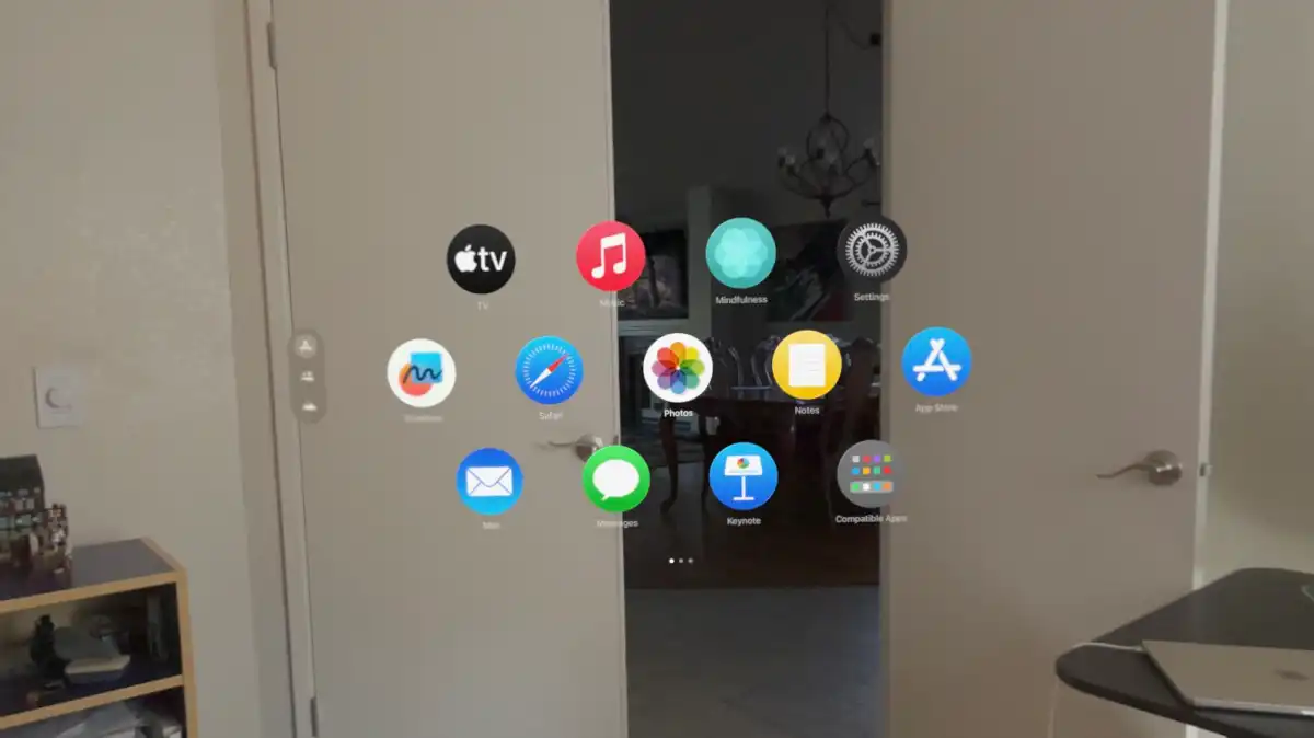
App administration issues extend beyond the apps that are currently functioning. The Home View displays apps as small circles in a honeycomb-like array, with the first page being fixed Apple programs and the subsequent pages containing your apps, alphabetically.
The first page is not alphabetically ordered, which is perplexing. There is no way to adjust anything, and it is really aggravating. Perhaps most odd is that iPhones, iPads, and Macs all have docks, yet the Vision Pro does not. Top on the agenda for visionOS 2.0 is a completely redesigned Home View and app management experience.
It’s simple to complain about these issues since the limits and potential remedies are so evident. However, the experience of physically installing apps in the actual world is rather great. As restricted as everything feels right now, it hits you in the stomach on the first day how handy it will be to have apps in one spot.
One day, an AI-powered smart grocery list will be virtually pinned to your fridge, similar to how you used to attach a paper shopping list with a magnet. It will automatically update when you open your cabinets and fridge to see what is missing, and it will be in your view when you go grocery shopping, following you around and indicating aisles and shelves containing the products you require.
The potential for incorporating computer-rendered pictures into the actual environment, combining interaction, intelligence, location, and your own personal preferences, appear unlimited. We have always been able to conceive these things, but this is the first product that delivers an experience that seems like it is really producing the technology to make them happen.

It’s also worth discussing apps that are either absent or badly covered. There are no calculators or weather applications. You cannot use Find My to find your Vision Pro hardware, and there is no Find My software (even the iPad version) to locate your friends or other Apple devices. Maps is the most apparent “spatial” possibility among Apple’s own applications, but it is only available for the iPad. Strangely, there is no Contacts app at all.
Your contacts are synchronized and accessible within applications, but there is no location to manage them in Vision Pro. Instead, the Home View has a top-level “People” area, but it only allows you to make FaceTime calls because there is no FaceTime app.
It all feels oddly half-baked for a company that’s in the position Apple is in today. Some apps and experiences are fantastic, while others feel incomplete or missing entirely.
Productivity, or lack thereof
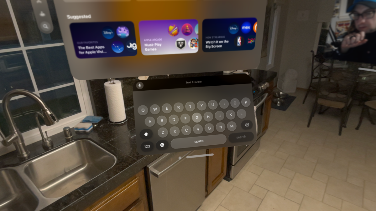
The keyboard is laughably rudimentary and nearly hard to use for anything other than inputting URLs; if you want to compose words, you must link a Bluetooth keyboard. You can utilize dictation, but it’s less effective than on an iPhone or iPad since the “look and pinch” interface makes picking text to make edits cumbersome.
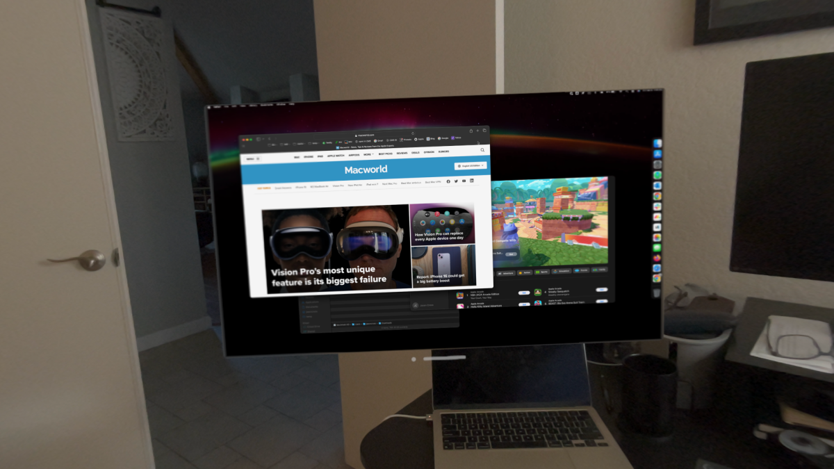
If you want to be productive, you need have at least a keyboard and a touchpad, and ideally a MacBook. Here’s one of Vision Pro’s neatest tricks: simply stare at a MacBook logged into the same Apple ID, and a Connect button will appear hovering above it.
One pinch-select later, you’ll have a floating 4K virtual display with exceptional quality and minimal, but detectable, latency. However, there is only one, and it cannot be a secondary display to your real-life MacBook display, which is turned off. You can accomplish the same thing on a Mac desktop by utilizing the Vision Pro control panel.
This restricts its applicability to situations in which you simply require a larger screen but do not have the necessary space. When it comes to productivity, a physical secondary monitor will outperform in nearly every regard. Oh, and the audio will only come from your Mac rather than from the Vision Pro speakers for some reason.
makes you feel like a productivity god
When you see your Mac in this way, adding visionOS or iPad applications to the left or right side feels like it enhances your possibilities at first. Concentrate on the job at hand while a Notes window floats to your left, Safari on your right, and some streaming movie or Apple Music plays in the background. All you have to do is look over at any of these windows and your Mac’s keyboard and trackpad will automatically operate that program using Universal operate.
It’s like magic, and you’ll feel like a productivity god. (It’s worth mentioning that Vision Pro does not support mouse input. Even the mouse linked to your Mac will only operate with your Mac display window. It’s a touchpad or nothing.)
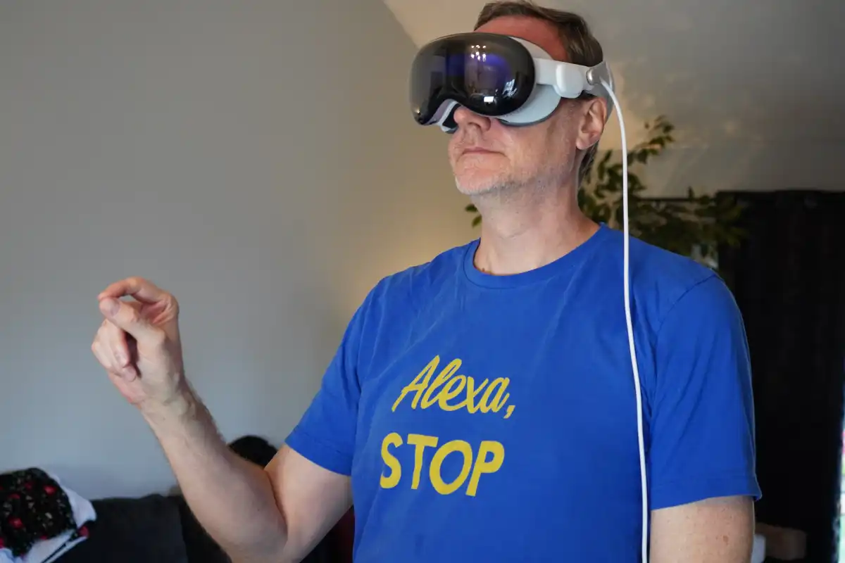
But then you attempt to do anything and find you’re just twisting your head all over the place to utilize lower-level versions of the programs on your Mac, and these floating windows are getting in the way of each other. With rare exceptions, launching new windows on your Mac (and maybe adding them to new Spaces) is faster and easier.
For example, while working on this review and taking notes on my MacBook on a virtual display, I ordered some wings for lunch through the floating visionOS Safari window to my left. I was able to effectively navigate the site and place my order, due in large part to address autocomplete and quick Apple Pay checkout (you don’t want to input a credit card number on the visionOS keyboard), but a real mouse and keyboard would have made things much faster and easier.
I could have opened a browser tab on my Mac, placed my order, and closed it in less than half the time by experimenting with look-and-pinch in visionOS. Also, I might have utilized the browser of my choice.
The entire Apple Vision Pro experience might occasionally seem like this. The first few times you accomplish anything, the possibilities are so thrilling that you lose sight of how inefficient everything is right now. As time passes, you realize that you could just accomplish whatever you’re doing faster and simpler on your iPhone or Mac. All of this will be improved with better applications and VisionOS capabilities, but they are not currently available.
Incredible but isolating media consumption
The Vision Pro app experience excels in media consumption. Simply watching films is an amazing thrill, thanks to the outstanding built-in speakers and spatial audio, the stunning and brilliant screens, and the unique head and hand tracking technology.
The thing that strikes me most about media consumption is just how isolated it is
Viewing flat material is stunning, whether it’s on Apple TV+, Disney+, or in a browser (there is no Netflix app). It’s crisp, bright, and has a wide color and dynamic range. Some programs allow you to view in a virtual setting, such as Disney’s El Capitan Theatre or the dunes of Tatooine. Movies created for 3D have never looked better. Watching the newest Avatar or Guardians of the Galaxy in 3D is almost as good as going to the cinema.
Then there are the “spatial” videos, which are 180-degree 3D videos that Apple has made available through the TV app. There are a few, including an immersive dinosaur experience, an up-close encounter with rhinos, and an Alicia Keys concert while standing next to her piano—and they’re all incredible.
They are also not completely new. There are several 3D 180-degree or 360-degree videos available on the internet, including those hosted on YouTube and DeoVR. However, playing these films on the web does not now work and will not until Apple adopts the correct WebXR standards. Stand-alone video players such as Moon Spatial Player and Reality Player are working on adding support for these videos, but it’s still quite primitive and problematic.
What strikes me most about media consumption is how solitary it is. Obviously, there are moments when you desire that, but watching movies or television is frequently a social activity. When I showed my wife the Disney Theater, she asked, “Wouldn’t it be cool if you could look to the side and see me in the seat next to you, and I could see you, and we could watch a movie together sitting next to each other even if we were hundreds of miles apart?”
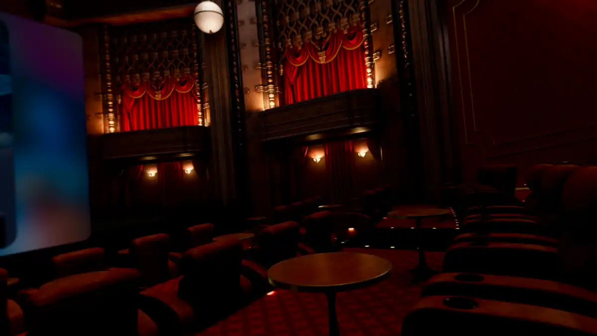
It’s an apparent case, a wonderful “you can only do this in Vision Pro” example, but it’s not something Vision Pro can easily handle. Apple already has all of the components—Personas (in beta), SharePlay, and spatial audio—they simply need to be better integrated. One would expect that this type of “only on Vision Pro!” experience would have been a primary focus throughout development, rather than simply watching movie in a virtual environment at a higher resolution than on the numerous other VR headsets that have been doing virtual theaters and environs for years.
Speaking about 3D video, shooting spatial films with the Vision Pro or iPhone 15 Pro is quite effective. The final film, despite its limitations, is similar to staring inside a live diorama cutout of a historical event. There are some limitations—it works best at a distance of 4-8 feet and requires a stable camera—but this is a far superior method to remember memories than flat video. It feels strange to say this, but it’s the closest thing Vision Pro offers to a killer feature.
that’s literally seven times the price of a Meta Quest 3
Pricing that is out of control
While we do not assess items purely on price, value is always an important factor, and the pricing of Apple Vision Pro must be addressed. Not only is the equipment extremely pricey, but so is everything associated with it.
The headset itself may nearly justify the exorbitant starting price of $3,499 (US-only at the time of writing). Yes, it is exactly seven times the price of a Meta Quest 3. But, with unbelievably good screens, hand and eye tracking, and everything else that results in a far higher-fidelity experience, you can nearly justify it. Almost.
But what is up with the pricing of all the other Vision Pro stuff? Most of it is priced at $199, no matter what it is (a huge red flag if there ever was one). It’s almost as if Apple is just trying to see what they can get away with.
Areas of improvement
Speaking of what I can’t wait to see in a future version, a better price is just the beginning. There are so many things Apple needs to address before this can really take off.
It needs to shed about a third of its weight
Obviously, there’s visionOS things. I should be able to tie apps to me rather than to the surroundings. There should be a category of “heads-up-display” widgets that remain in my range of vision. The fully isolated experience must seem more sociable, with immersive SharePlay video viewing, much better Personas, and genuine spatial-oriented social networking and communication tools from third-party developers. Window management and text input require a significant update. It need additional gestures and multitouch options, as well as Find My, Weather, Calculator, and all of the other missing applications, as well as true spatial versions of iPad apps.
However, some of the Vision Pro’s demands cannot be met without additional hardware. The field of view is a little too small, with obvious black bars that make it feel like you’re looking through a dive mask (Apple won’t disclose what it is, but it looks like 100 degrees). It needs to lose around one-third of its weight. Video passthrough may be unnecessary in the future, but in the meanwhile, it must be significantly improved, particularly in low light conditions.
Then there’s the fact that this gear was designed to be utilized indoors, either at home or at work. There is no cellular connection, so programs can’t follow you or be tethered to moving items. Remember that next time you see someone pretending to use one in public on your social feeds.
The USB-C port on the battery back really should be used for both power and data, too. That would enable physical security keys, microphones and audio interfaces, HDMI input (with an adapter), external storage, and a host of other extremely useful functions.
Vision Pro needs to demonstrate why it must exist
There’s so much exciting new things going on with Apple Vision Pro that we could talk about it all day. It is not just Apple’s newest product, but also the most costly first device in a category since the original Mac (adjusted for inflation). There are totally new interaction patterns in play, societal norms are being tested, and the legal and regulatory concerns are undoubtedly only getting started.
At the end of the day, you have to decide whether this first-generation gadget is worth it. Leaving aside the fact that Apple’s other first-generation products were never priced so high above their competition, it’s still difficult to suggest right now.
More than anything else, Apple Vision Pro must demonstrate why it exists. There is nothing you can accomplish with it right now that cannot be done in another method, which is frequently easier, faster, and less expensive. It sorely needs a few “killer apps.” It must do tasks that would be impossible to complete without “spatial computing,” and flying iPad app windows around your flat is not sufficient.
There is a lot of potential in both this gadget and the larger spatial computing effort in general. However, we do not assess potential; rather, we review products. Apple Vision Pro, the device, not the concept, is still too limiting, too isolating, and too ineffective for work or enjoyment to be worth investing in.
Some of these issues can be rectified with more mature software (both visionOS and applications), while others require more powerful hardware. Even fanatical Apple early adopters should wait for the former, while regular fans may wait for the latter.


