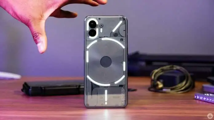
It’s difficult to establish a technological firm from scratch, which may be why former OnePlus executive Carl Pei titled his new company Nothing in 2020.
So far, the company has developed a phone and three earbud types. Its product hype works great in tech enthusiast circles but has failed to break over into the masses.
Nothing’s latest smartphone, the Nothing Phone (2), is an enhanced version of the Nothing Phone (1) from 2022, and I’m not convinced it’ll help the brand break through, even receiving a full US release. It has a very similar design and camera, and it feels almost comparable in usage.
The software is better, but existing owners are promised an update with the enhanced OS, so there’s no incentive to change.
At $599/£579/€679, the Nothing Phone (2) is a competent, well-priced mid-range phone – but there are many of such on the market currently. However, not all of them feature customizable flashing lights on the rear.
Design & build
- iPhone-inspired design
- Programmable LED lights
- IP54 rating
I’ll try not to spend the entire review comparing the Phone (2) to the Phone (1), but not much has changed:
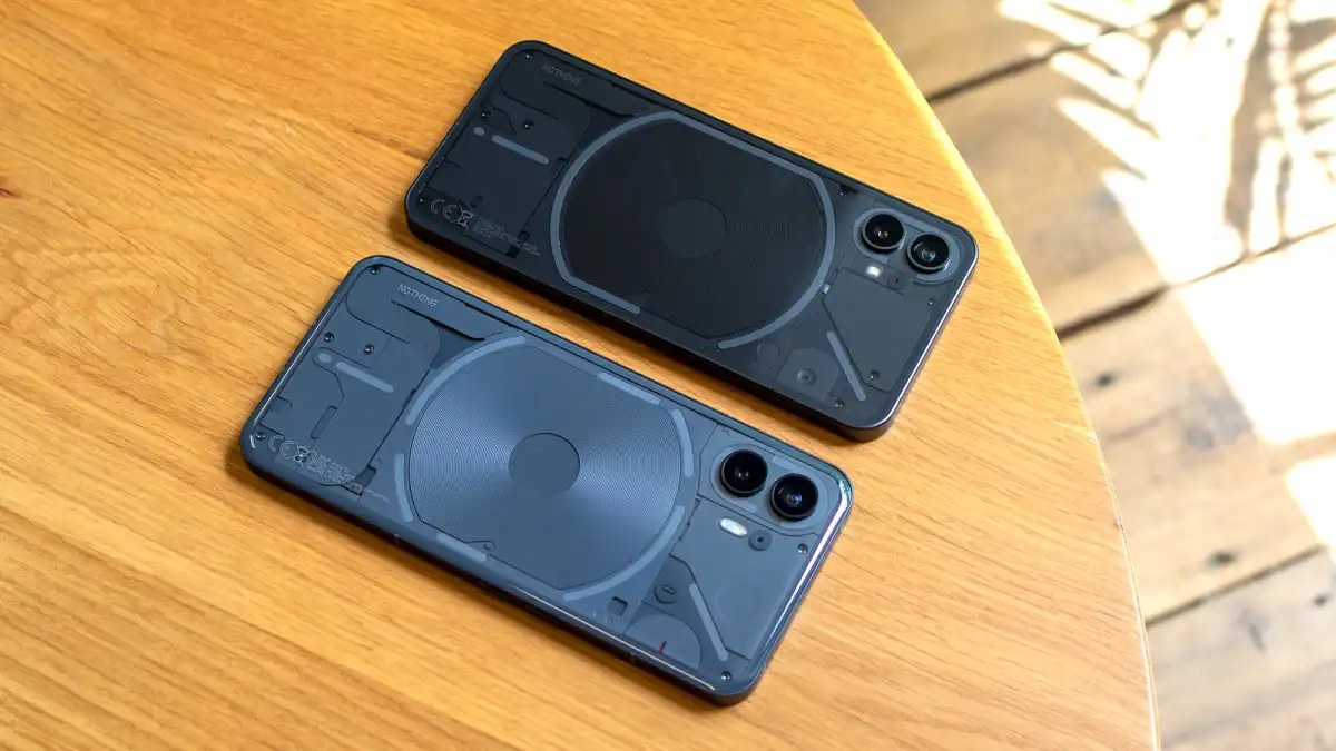
Having saying that, I applaud Nothing for at least trying to make the design interesting. Everyone who saw me using the Phone (2) asked what it was (or assumed it was an iPhone).
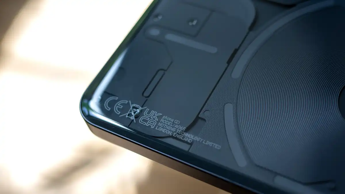
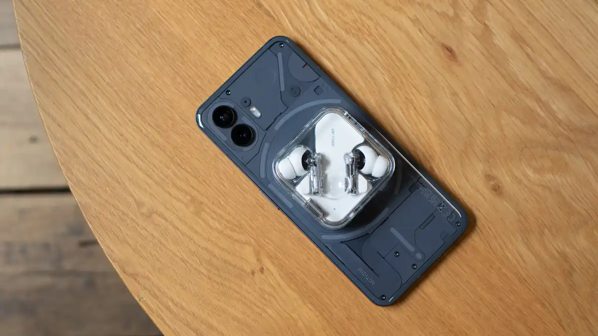
The Phone (2) is well-made, with a 100% aluminum frame and clear glass on the back that reveals a clever array of internals and ‘glyph’ LED light strips that flash to indicate calls, alerts, and other programmed things.
These lights differ somewhat from the Phone (1) in that the center light is now divided into six strips rather than one, and the camera lights are divided into two. While facing down, the LEDs towards the bottom can display the charge level.
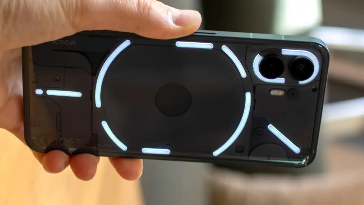
One of the center LED strips now has 16 distinct parts and may be used to display the progress of a countdown timer, your volume level, or even how long it will be until your Uber comes. Nothing beats additional third-party app support, but a single light strip provides far less usefulness than what developers can do with information in Apple’s Dynamic Island software on the iPhone 14 Pro.
The glyph lighting do make the Phone (2) stand out in comparison to the iPhone 12, from the flat edges with curved corners to the rounded display and enlarged buttons.
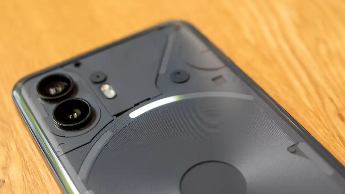
My review sample is the grey model, which is lighter than the Phone (1), which is closer to black. There’s also a white variant I’ve never seen before.
The back glass is gently curved at the corners to provide a smoother feel, but the front Gorilla Glass above the display is flat. The phone’s overall dimensions are 162.1 x 76.4 x 8.6mm, and it weighs 201g. I find the phone a touch heavy and can’t use it comfortably with one hand.
The haptics disappointed me: the vibration motor that buzzes as you use the keyboard is extremely rattly and noticeable even in very calm settings. I tweaked it, and it improved, but it still falls short of the quality of more costly phones.
A wonderfully even bezel surrounds the edge of the screen on the front, accented by a central camera cut-out at the top.
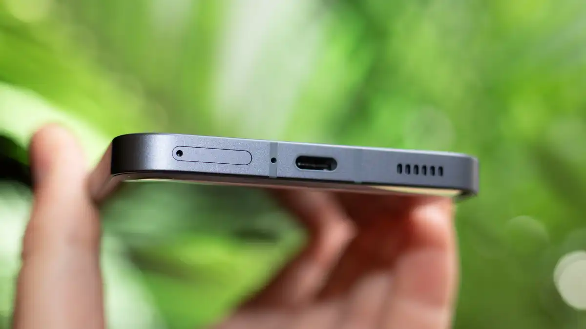
I find the phone a little cumbersome and certainly can’t use it comfortably with one hand
It’s also a letdown that the phone only has an IP54 dust and water resistance classification, suggesting that it can withstand rain and splashes but not a dip in the bath, pool, or sea. Both the Samsung Galaxy A54 and the Google Pixel 7a, which are similarly priced, have higher IP67 certifications.
Screen & speakers
- 6.7in OLED
- 120Hz LTPO
- Decent stereo speakers
The Nothing Phone (2) sports a 6.7in OLED screen, which is somewhat bigger than the Phone (1)’s 6.55in screen.
It was a high-quality show, in my opinion. It can refresh at up to 120Hz and employs LTPO technology to reduce the refresh rate to 1Hz when not needed to preserve battery life. LTPO is not commonly found in phones at this pricing point.
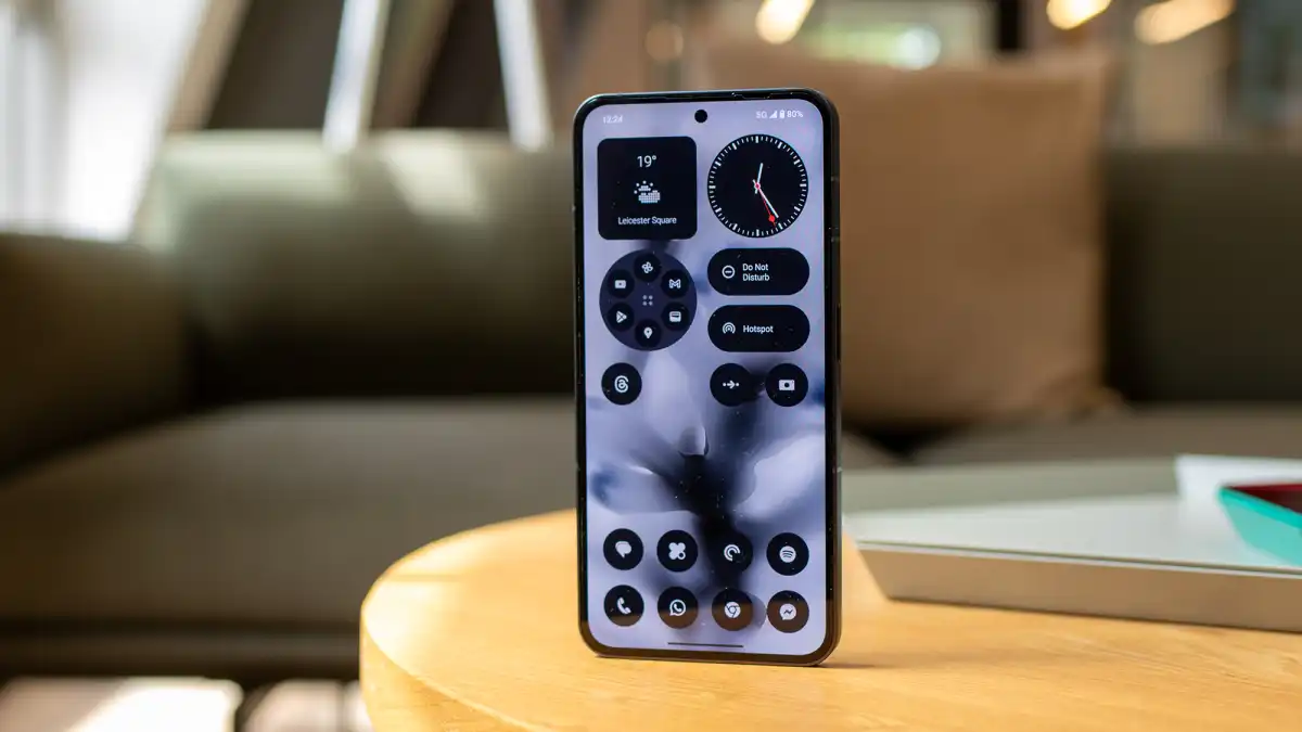
The problem is that the panel does not get bright enough. Even though it was sunny inside, I went to raise the slider only to find it was at its highest position.
The screen is difficult to see clearly outside. Nothing states it reaches up to 1,000 nits outside – it’s insufficient, and one of the most bothersome aspects of the Phone (2). Indoors, it may reach 1,600 nits.
Because of the frequent glare in the sunlight, I frequently used the phone in light mode to make the screen easier to see – I seldom do this and prefer to use most other review phones in dark mode.
The phone comes with a screen protector, however it’s cheap and made of plastic. For a phone that invites you to put it face down all the time to see the lights on the back, I got some terrible scratches on mine after three days. You’ll need a case with a lip to protect the screen, and preferably one that is transparent so you can see the lights.
Because of this frequent dimness in the sunshine, I ran the phone in light mode to easier read the screen – I rarely do this
Dual stereo speakers are standard on mid-range phones, and the Phone (2) provides them. They’re adequately loud for podcasts, YouTube, and gaming, but music sounds thin and piercing at high volumes.
Specs & performance
- Snapdragon 8+ Gen 1 chipset
- 8/12GB RAM
- 128/256/512GB storage
The biggest internal improvement over Phone (1) is the Snapdragon 8+ Gen 1 processor, which is also featured in the OnePlus 10T and the Samsung Galaxy Z Flip 5. This provides 5G capability, but check which bands it supports and whether it is compatible with your carrier, particularly in the United States.
The phone isn’t the newest 8 Gen 2 from Qualcomm, but it’s quick enough for everything from day-to-day use toggling between applications to playing Call of Duty Mobile for half an hour without lag.
It’s not flawless, and there were times when I could tell the operating system was stalling significantly. This is a strong phone, however it does not work as well with software as current OnePlus or Samsung phones in the same price range.
My Phone (2) review sample came with 12GB RAM and 256GB storage, with the former presumably aiding performance. You may also choose between an 8GB/128GB model and a 12GB/512GB model. There is no microSD slot, although all versions have two physical SIM card slots.
Here’s how the phone fared in CPU and GPU benchmark testing when compared to the Phone (1) and some other phones with comparable specs and prices:
Nothing Phone (2) benchmarks
In contrast to the face unlock, which is fast and effective for unlocking the phone, the in-screen fingerprint scanner is located rather low down on the screen and works well. It can also be used for biometric sign-in to third-party apps.
Camera & video
- Main 50Mp lens disappoints
- 50Mp ultra-wide
- 32Mp front facing
The Phone (2)’s main camera employs the Sony IMX890 f/1.88 sensor, which is quite identical to the IMX766 used in the Phone (1). It implies that there have been little advances, and I’ve been unsatisfied with the images I’ve taken.
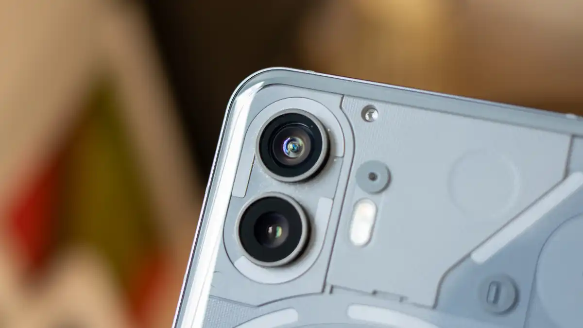
The IMX890 sensor was utilized in Pei’s previous company’s recent OnePlus 11, which I examined and found its primary camera to be consistent and of good quality.
The primary camera on the Nothing Phone (2) is not one of those things. It’s adequate for shooting in a pinch, but far from ideal. For still images, it falls short of the Pixel 7a, which costs more than $100/£100/€100 less.
For a phone marketed partly around its photo improvements, the Phone (2)’s cameras are merely OK
The primary camera performs admirably in bright sunlight, as do most smartphones in 2023. It takes 12Mp stills by default, but you can alternatively shoot at full 50Mp resolution. It produces reasonably true-to-life colors and has a good focal range that responds well when I tap the screen to alter focus:

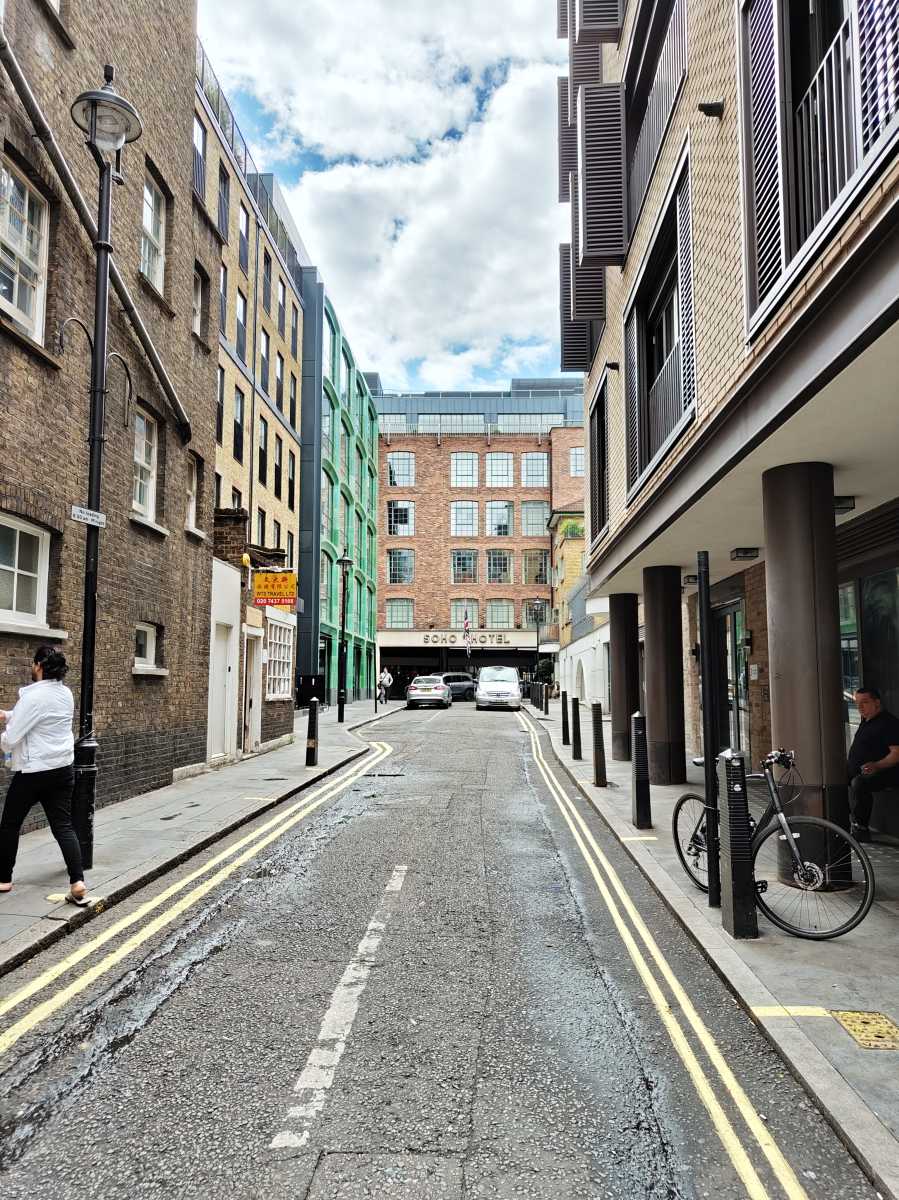
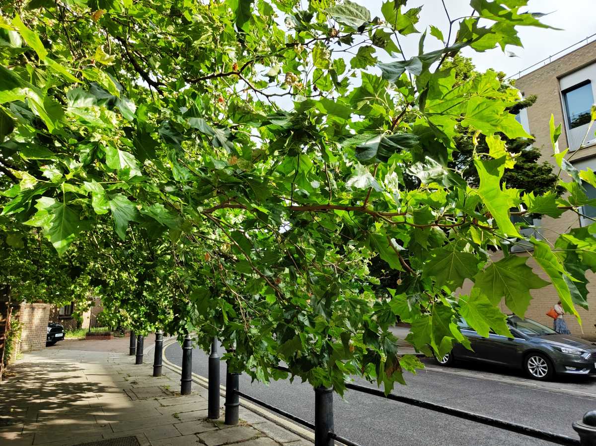
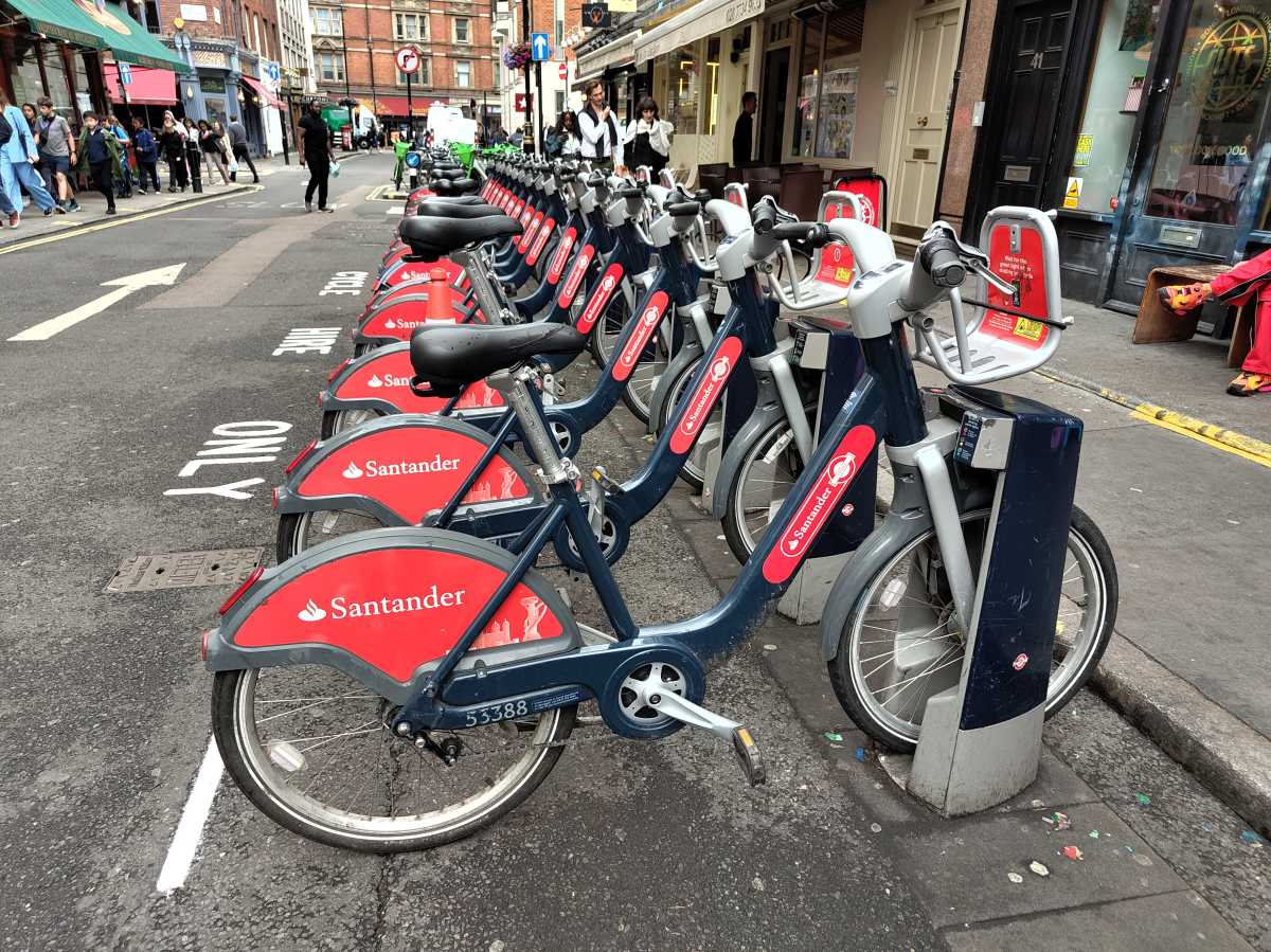
In all but the greatest lighting situations, Nothing’s image processing is unnecessarily harsh, either sharpening photographs excessively or imparting an orangey tinge to skin tones and surfaces. It also issues with intense sunlight, which means that depending on the focus point, photos might frequently blow out the sky or make the subject overly dark:
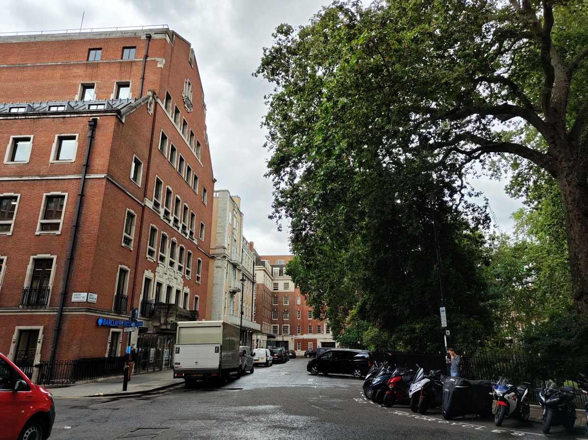
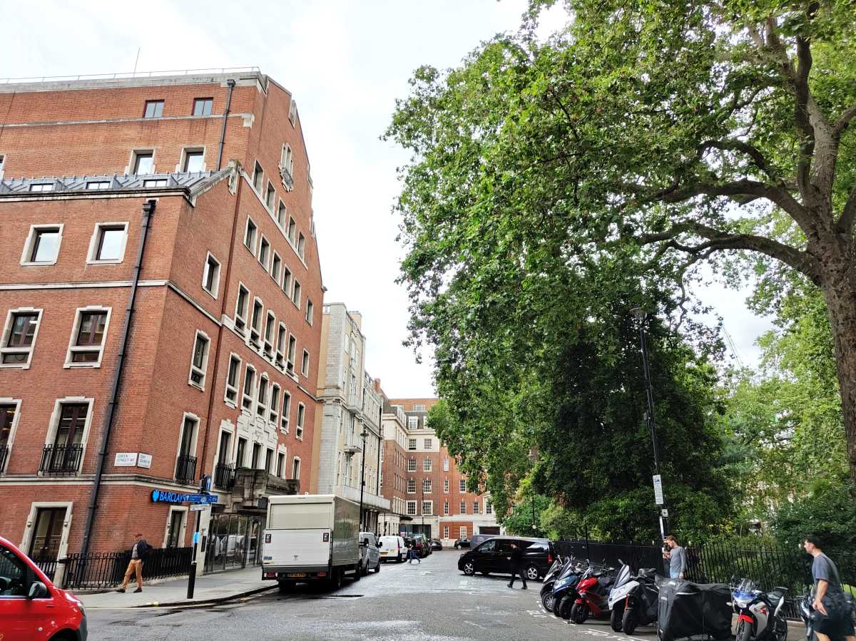
There’s also a lot of shutter latency, especially when zoomed in, and the shutter button occasionally doesn’t respond at all.
The video quality is basic and about what you’d expect from a phone at this price. It can record in 4K at up to 60 frames per second. There is strong stabilisation (both optical and electrical) and an action mode that successfully keeps judders at bay, although it isn’t as good as the action mode on the iPhone 14 (which is, admittedly, a more expensive phone).
With its 50Mp f/2.2 Samsung JN1 sensor, the ultrawide lens is adequate for capturing more of a scene. It even performs well in low light, although image quality worsens when zoomed in, and information is lost:

There is no telephoto lens, but you can photograph at 2x using digital zoom and zoom up to 8x using a toggle in the app.
The 32Mp front-facing camera is the most appealing of all, generating sharp, bright images…
For a phone marketed partly around its photo improvements, the Phone (2)’s cameras are merely OK. If camera is your priority, get a Pixel 7a for cheaper.
Battery & charging
- Decent all-day battery life
- 45W charging
- 15W wireless charging
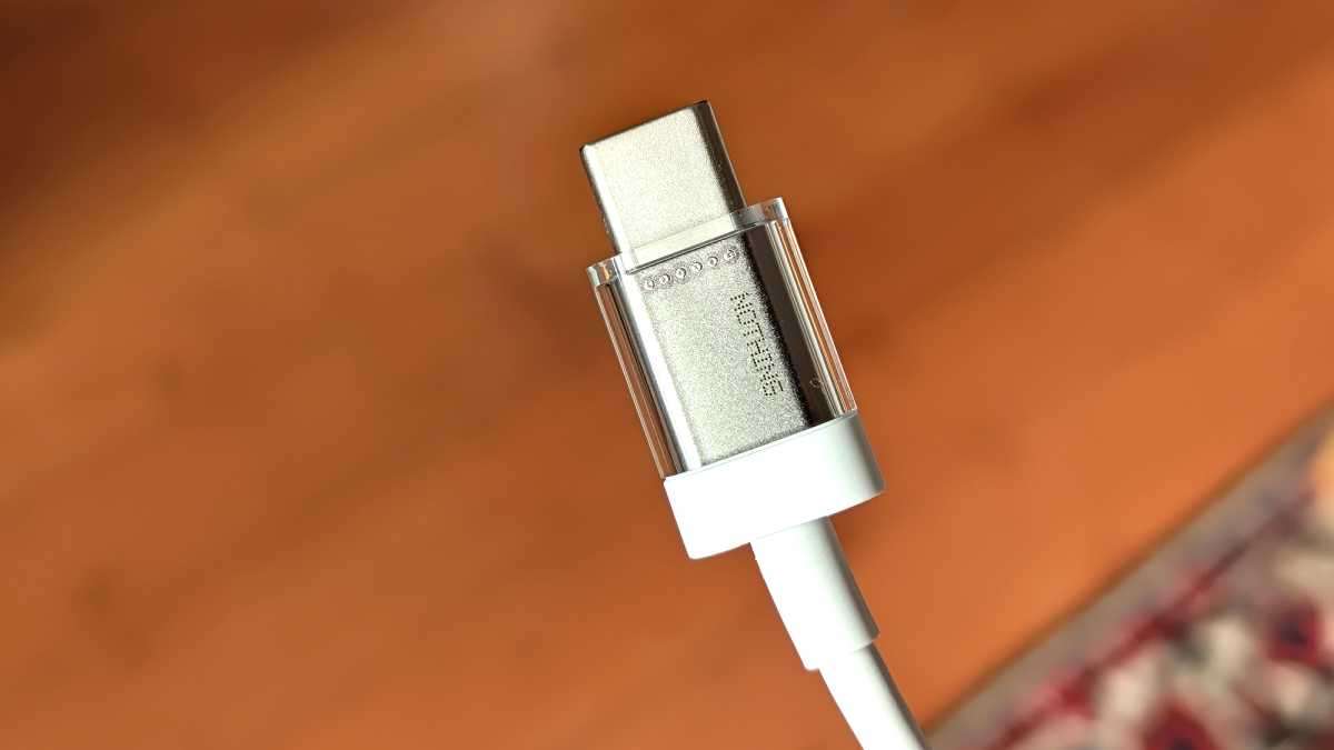
The battery life is exceptional. When I unplugged at 7 a.m., I generally had 80% remaining by noon and 30% left by 10 p.m. The 4700mAh cell performs admirably here, and I believe the energy-saving LTPO display technology also contributes.
In PCMark’s battery test, it scored 14 hours and 17 minutes, which is better than the 5000mAh Galaxy S23 Ultra’s score of 12 minutes and 43 minutes.
Software & updates
- Thoughtful, stylish software skin
- Three years of Android updates
- Four years of security patches
At debut, the Phone (2) runs Android 13 with Nothing OS 2.0, an upgraded skin. It’s the finest feature of the gadget, providing a very distinct appearance and feel to the home screen. It’s fantastic.
Android 13 allows users to ‘theme’ apps to a certain color palette, however app developers must provide such a customized app icon. Even if you theme the applications on your Google Pixel phone’s home screen, some will most likely refuse to cooperate and remain colorful.
Nothing OS 2.0 is the best thing about the device, offering a genuinely unique look and feel to the home screen
Nothing has a new icon set that automatically themes all of your programs. It’s excellent, because it means that in light mode, icons seem white with a black icon, and in dark mode, icons appear black with a white icon. It’s also simple to change the look of your home screens by modifying the layouts, widgets, and Nothing’s wallpapers:
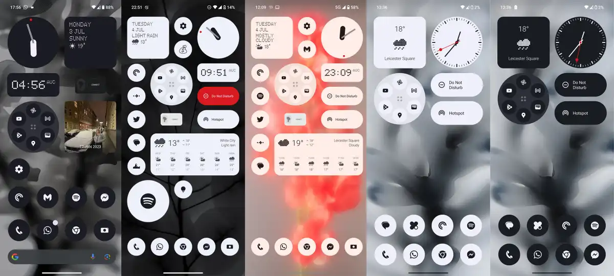
Aside from the ability to customize the home screen, the OS is actually fairly simple. Menu headings and the new always-on display employ a digital clock-style dot matrix typeface, but the overall appearance and feel is comparable to that of a Nokia or Motorola phone that doesn’t go too far from basic Android.
There’s also a ringtone composer (what, 2002?) using Swedish House Mafia sounds, and you can program the glyph lights to flash in time with your compositions. There are 10 preset call and notification tones that you may attach to apps or contacts.
I loved the ability to configure ‘important notifications,’ so that if I lay my phone down, one of the lights will stay lit if my wife has messaged me. It’s useful.
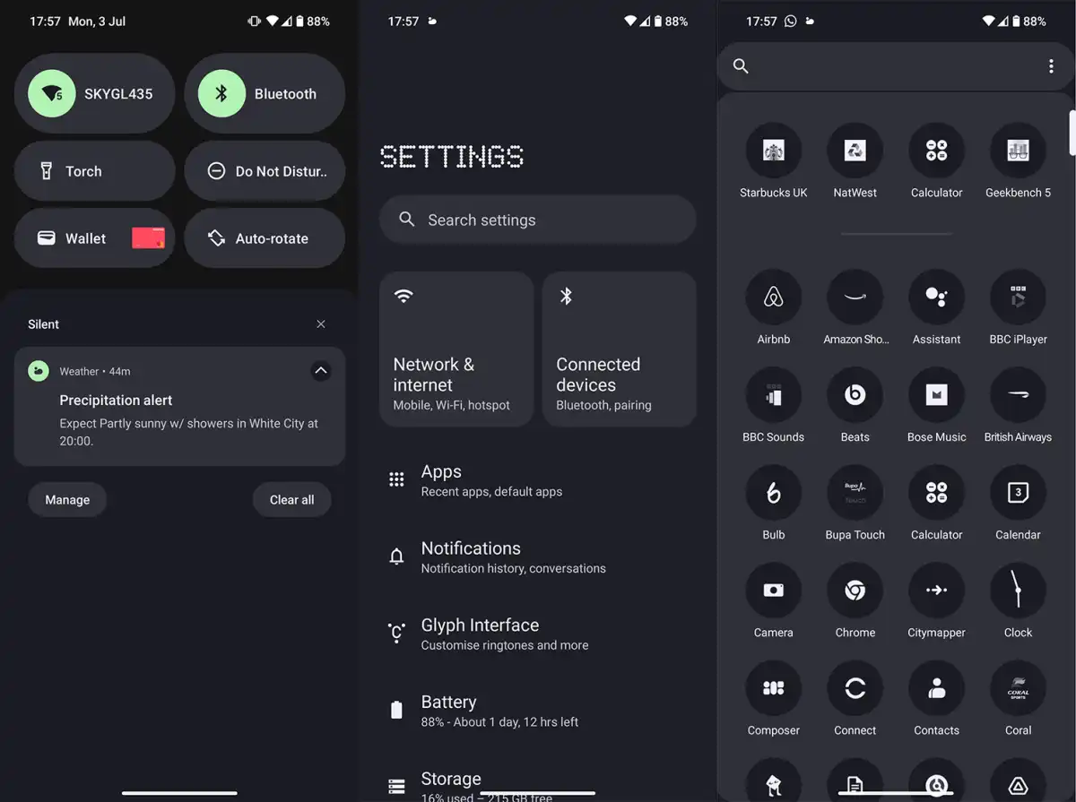
You can also silence the phone by flipping it over, and configure features like double clicking the screen to lock it.
Nothing guarantees three years of Android upgrades (until 2026) or four years of security fixes every two months (until 2027). That’s strong, and it’s only a year behind Samsung in each category. It’s remarkable that a young firm can outperform Nokia, Sony, and others in terms of software support. However, it only has two phones to update thus far.
Price & availability
The Nothing Phone (2) starts from $599/£579/€649 for the 8GB RAM/128GB storage model.
You can also get 12GB/256GB for $699/£629/€699 and 12GB/512GB for $799/£699/€799. The latter sounds expensive, but it’s a good price for that much storage.
Nothing is only selling the Phone (2) through its official store and a few select retail partners. It has no mobile carrier partners for the device.
Verdict
The Nothing Phone (2) boasts flagship features at a mid-range pricing, yet it still has a mid-range feel about it. The display and camera, in particular, are underwhelming, and the phone’s hefty design makes it huge and cumbersome to use.
However, Nothing OS 2.0 is fantastic and distinguishes Android phones from those of other manufacturers in a positive way. The phone also boasts a long battery life and wireless charging, and the glyph lights are innovative – but you’ll either love them or despise them.
Mid-range problems like as an IP54 rating, a dull screen, and occasionally cheap-feeling haptics stand out. However, if you like the design and don’t believe the lights are a gimmick, the Nothing Phone (2) is worth considering, especially because it comes with four years of software support.
Specs
- 6.7in 120Hz LTPO OLED display
- Rear camera:
- 50Mp, f/1.8 OIS main camera
- 50Mp, f/2.2 ultrawide camera
- 32Mp, f/2.45 selfie camera
- 4700mAh battery
- 45W wired charging
- 15W wireless charging
- 5W reverse wireless charging
- 5G
- Stereo speakers
- Wi-Fi 6
- Bluetooth 5.3
- NFC
- Glyph Interface LED lights
- IP54
- Gorilla Glass
- Android 13 with Nothing OS 2.0
- 159.2 x 75.8 x 8.3mm
- 201g


